True luxury does not scream for attention; it waits to be noticed. In the realm of high-end menswear, the deliberate absence of visible logos forces a garment to rely entirely on its intrinsic physical properties. The concept of “effortless elegance” is, in reality, a carefully constructed sartorial illusion. Looking relaxed yet perfectly put together is never an accident—it is the direct result of meticulous textile engineering.
To truly master the aesthetic of classic quiet luxury shirts, one must move beyond brand prestige and analyze the garment at a macroscopic level. The secret to this understated aesthetic lies in the precise interplay between two critical elements: the physics of the fabric drape and the technical architecture of the color palette.
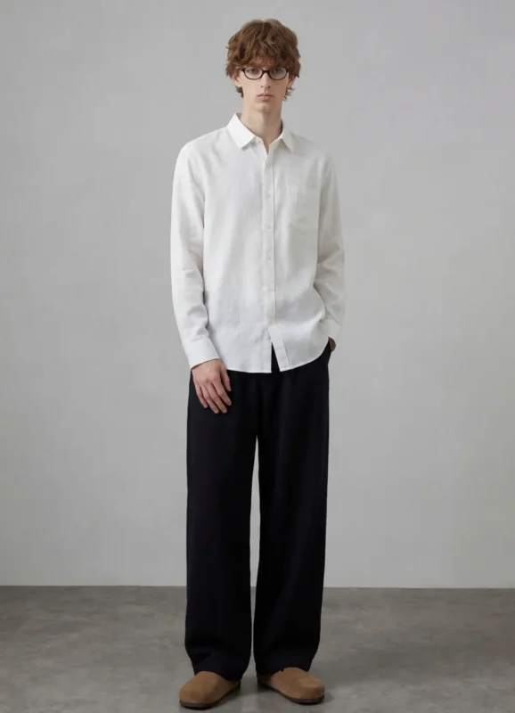
The most glaring difference between a premium luxury shirt and a mass-market alternative is how the fabric interacts with gravity and the human body. Quiet luxury brands do not rely on stiff, restrictive tailoring to create shape. Instead, they engineer fabrics that possess the exact weight, tension, and memory required to drape naturally.
A shirt that embodies effortless elegance must move fluidly without clinging. This requires high-quality natural fibers woven with a specific tension. For summer shirting, top-tier Italian houses utilize high-grade Normandy linen or Sea Island cotton. Rather than being woven tightly to mimic cardboard, these yarns are often loosely tensioned but densely packed.
This creates a high specific gravity within the textile. The fabric is heavy enough to fall cleanly from the shoulder to the hem, yet breathable enough to remain comfortable. Furthermore, luxury linens are often treated with proprietary enzymes or natural softeners—such as the aloe vera treatments famously used by top-tier mills—removing the initial scratchiness and allowing the shirt to drape like a fluid second skin from the first wear.
The drape of a quiet luxury shirt is heavily defined by what it lacks: rigid structural interfacings. Mass-market shirts utilize stiff, glued-in interfacings in the collars and cuffs to maintain a sharp appearance.
The color palette of quiet luxury is not merely an aesthetic choice; it is deeply rooted in the chemistry of dyeing high-end natural fibers. While fast fashion relies on synthetic fabrics that reflect harsh, artificial light, premium natural fibers absorb and diffuse light, creating depth and richness.
The hallmark of cheap fabric is an unnatural sheen. Synthetic blends—or heavily chemically treated cottons—reflect light uniformly, making the garment look flat. Classic quiet luxury shirts excel in light absorption. Because high-twist cottons, raw silks, and premium linens possess microscopic irregularities in their natural yarns, they diffuse incoming light. This creates a matte, powdered finish that looks incredibly expensive precisely because it lacks artificial luster.
The color logic of quiet luxury revolves around desaturated, low-contrast tones. These colors are specifically chosen because they mimic the natural world and are notoriously difficult to dye perfectly.
To achieve true depth of color, luxury shirtmakers frequently use melange yarns. Instead of dyeing a finished piece of cloth a single solid color, mills will dye the raw fibers in two or three slightly different shades of the same base color before twisting them into a single yarn. From a distance, a melange grey shirt appears solid; up close, it reveals a complex, micro-pixelated texture of charcoal, ash, and silver. This microscopic color variation is the ultimate hallmark of high-end textile production.
The true genius of a classic quiet luxury shirt becomes apparent when the fabric’s drape and its color palette interact.
Consider a premium linen shirt dyed in a desaturated sage green. Because the unlined collar and Neapolitan shoulder allow the fabric to fold naturally over the collarbone and chest, the physical drape creates organic shadows. Because the matte, natural fiber diffuses light rather than reflecting it, these physical shadows deepen the sage dye in the recesses while highlighting the slub (the natural thickening of the linen yarn) on the peaks.
This dynamic interplay between light, shadow, dye, and gravity creates a garment that looks continuously alive. It cannot be replicated by stiff polyester or flat, piece-dyed commercial cotton.
Understanding the effortless elegance of classic quiet luxury shirts requires shifting your perspective from the brand tag to the textile itself. It is a rigorous discipline of subtraction—removing stiff interfacings, eliminating harsh synthetic dyes, and stripping away loud branding. What remains is a garment stripped down to its most fundamental physical truths: the calculated tension of the weave, the fluid gravity of the drape, and the sophisticated light diffusion of perfectly calibrated, desaturated color. This is the essence of true sartorial value.

